Monday, 14 June 2010

Design Down Under


Well after finishing the final project and it all being handed in, leaving only my final grade to be awaited... I wanted to start blogging again but broadening what I blog about and thinking about further design interests aside from my university work.

Australia is a huge passion of mine, and so I carried out an online search into Australian design. To my knowledge, Australia is not as well known for design as London, Milan, Paris, New York etc, and so I would like to research this further, putting Australia firmly on the map for notable design!


The above images show the interior of an Australian Butchers, 'Victor Churchill', which won the award for 2010 Retail Design in the Australian Interior Design Awards, designed by the company, 'Dreamtime Australia Design'.

Upon first glance, I thought that this was an interior of a luxury clothing shop and it surprised me to discover that it is in fact the interior of a Butcher!

In a recent TV series by Mary Portas, Portas discusses how we are losing interest in the traditional specialist stores including the butchers and bakers to supermarket competition.

I feel that this approach to designing luxurious and innovative interiors for these independant retailers, may re-launch these stores in our contemporary society, therefore attracting new and re-gaining previous consumers, through a concept where both 'chic' and 'unique' are fast becoming factors that todays consumer are buying into...!

Any views?!

Although I enjoyed thinking about the connotations that could surround this image, ultimately it is also a beautiful piece of clever and genius design that is fully deserving of the design award that it won.

x x x

images from: http://www.interiordesignawards.com.au/gallery/2010/2/206

Tuesday, 1 June 2010

New Designers 2010

http://www.newdesigners.com/page.cfm/link=40

My ties have made it online! Alongside some other beautiful textiles from graduates all over the country!

Make sure you check out 'New Designers' 1-11th July 2010 to see all the emerging designers this Summer!

x x x


Thursday, 27 May 2010

Ties Tied


So... my project has come to an end and I am in the process of hanging my final show! I have not blogged in so long due to some serious workloads but this evening is a chance to relax!

These images show my final visualisations for my tie project...

I hope you enjoy...

x

Sunday, 11 April 2010

Ties in Testing...


The above sample reminds me of the Madras Check and is un-intentionally reminiscent of the original Indian Textile inspiration piece! Although the patterns are busy and the colours very bold, I feel it does work successfully as a statement tie.


A few more images of some of my designs visualised as the final outcome. I placed the fabrics on a bias beneath a window template (drawn round an actual tie to get the correct proportions and shape). It's exciting to see my designs looking significantly like the end product that they are intended for.

H&M, Hammam's and Madras Checks


Just a quick post, but after researching the Hammams and Madras Checks on Friday, while shopping in H&M on Saturday, there was obvious influences from both these areas of research which I found pretty exciting! I recommend a visit and the most beautiful 'Hammam's' and checks are in the menswear department now. Above are some images taken from the website but there were more beautiful colours in store!

www.h&m.com


Friday, 9 April 2010

J.Press Ties and Madras Checks


While researching Madras Checks, I came across J.Press, an American company founded by Jacob Press who focus on quality and bespoke style with an emphasis on heritage. What interested me further is how the Madras check as been taken through and been used as a key inspiration for the tie designs which is great inspiration for my current project! Although all using the check design, each tie does have a very individual, bespoke feel about it through the use of colour and proportion. The ties are also woven with cotton as well as silk, another yarn for me to consider for my own work to achieve variation within the swatches.

This idea of colourful checks and striping, with a focus and consideration for that of the 'Madras check', is certainly something that I feel will add a sophistication to my designs. Alongside incorporating the detailed structures and patterns I have been previously experimenting with taken from my visual research, to ensure that an innovative and personal approach remains in my final outcomes.

Madras Checks


http://www.tablehunt.com/tablelinensprints.html

Madras Checks are another fabric that I had not heard of until I visited Drakes. These beautifully colourful fabrics pick up on smaller sections within my own woven samples, and it is interesting to see how I could perhaps choose an area from one of my samples and replicate it in a similar, geometric and colourful design to that of these Madras Checks.

As stated on the LA Times website (http://articles.latimes.com/2008/may/04/image/ig-essentials4) the Madras checks originate from Madras, in India (now called Chennai). The colours were dyed with vegetable dyes and the checked pattern drew upon Scottish tartan influences in the 1800's when Scottish regiments occupied the land.

The images remind me of my very first initial research for my project when I looked at indian textiles as initial fabric and colour inspirations:


http://www.vam.ac.uk/collections/asia/

Hammam Towels


As wider research towards to my current project, Kathryn Rickards from Drakes of London encouraged me to take a look at 'Hammam Towels'. I had not heard of these before and so I decided to take this advice and have a look!

Although they are not a similar end product (in terms of bespoke suiting/menswear), as originally they used for turkish bathing, the colour palettes are similar to my own and some of them are even hand-woven which is particularly interesting as I feel passionate about the importance of hand-weaving today.

The proportions of colour are significant in the sense that the towels may only have 2 or 3 colours in them, but when displayed together as small collections as part of one large collection, the colours become heightened.

To see the collections of towels together please take a look at the source:

http://www.scentsandfeel.com/index.php?cPath=1

Wednesday, 7 April 2010

Missoni Home, Beverley Hills


www.missonihome.com


http://articles.latimes.com/2010/feb/14/image/la-ig-0214-shopping-20100212


In the recent Missoni Home newsletter there are images of their new, first single-brand store in L.A. Designed by Patrick Kinmonth and Antonio Monfreda, it particularly interested me because the store exterior imitates a woven fabric composed of interwoven aluminium bands. This concept is reflective of the fabrics within the Missoni store and is taken even further though the lighting.

The store has small bands or slits for lighting, and as a result, further implying notions of a woven fabric ideally when the store is lit up at night but also providing more subtle suggestion to woven fabrics inside the store in the day.


A Beautiful Piece of Writing

While on the Drakes of London website, researching ties and products ahead of a visit later today, this beautiful piece of writing on the 'Inspiration' section of their website caught my eye and made me really consider my ideas in perhaps a more sophisticated fashion. Read below:

'We tend to agree with the maxim that men of style are never too fashionable, that idiosyncrasy always plays its part in stylish dress. And yet there are unspoken rules that a gentleman ignores at his own peril. Not exactly an arcane code, but there are unwary subtleties of dress. The smaller points of wearing a tie makes a good case for adhering to a certain form.'

I hope you enjoy reading this as much as I did.

Wednesday, 17 March 2010

Team Weave


So, it had taken 24 hours make the warps, and then a further 18 hoursto get them on to the loom, which could not have been possible without the help of the weave girls and of course, Erica, the best technician you could every ask for.

With the warp being 30 inches in total (3 warps of 10) I really needed them to help me wind it on! I wanted to post these photographs to show how much you should appreciate your peers and how much you need them in testing times at the loom!

Many thanks to them all! x

Thursday, 4 March 2010

Duchamp

http://www.duchamplondon.com/marcs_blog/

Worth a Look!!

I came across this blog just now while on the Duchamp website researching ties for my project. Not only are the ties beautiful but this is a great blog which I wanted to share with you all, one of the designers from the suiting brand 'Duchamp', and it has alot of posts about the inspiration behind the designs which is really interesting and inspiring in terms of going about my own design work. I will be looking at this alot after discovering it today! The presentation of it is very slick too and in keeping with the Duchamp brand and website.

Enjoy!

Wednesday, 3 March 2010

'Ties'


'Ties'

So, after being inspired by Gresham Blake, I have folded some of my initial samples in to mock-up tie shapes and attempted pocket squares...

I like them displayed in a fan and this was a good thing to do early on as it gets me thinking about presentation for the final show. A brightly coloured tie could add a really contemporary, quirky twist to a traditional style of suit! I would also like to try mocking up some more feminine ideas for neck-scarves and ladieswear fashion accessories too.

Monday, 1 March 2010

Gresham Blake


Gresham Blake Brighton

While walking the lanes of Brighton I came across this beautiful bespoke suiting shop, 'Gresham Blake'. The bright colours of the ties and the quirky designs instantly caught my attention, particularly as all the colours and designs are aimed at men.

At the start of my project I immediately associated my thoughts for using brighter colours with womenswear, however, visiting Gresham Blake has opened my mind up to more opportunities and ideas for aiming my fabrics at menswear too. The ties are handmade and woven in silk which immediately interested me further as the fabrics that I have just produced are all 100% silk, hand dyed and hand woven. Visiting Gresham Blake has become extremely inspirational for my current project and I would really like to aim my final designs at small fashion accessories for both men and women such as ties, pocket squares, neck scarves and linings.

My initial idea was to develop a fabric that could be used for both fashion and interiors, however, my initial warp and Gresham Blake has really heightened my interest for fashion and the fabrics so far are much more suitable for fashion and I feel will be much more appreciated through fashion. However, I want to include interiors somehow as I have such a passion for them, so they will remain incorporated as inspiration for my fabrics through colour, scale and proportional qualities.

I particularly like the presentation of the fabrics and ties in the last photograph and I would like to use this as inspiration for presentation in my final show statement.

More information on Gresham Blake can be found on: www.greshamblake.com and www.gbties.com

Bold and Bursting


Bold and Bursting with Colour

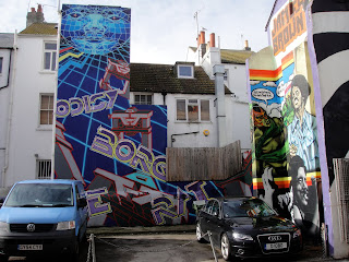
2 weeks later and I went to Brighton again this weekend, I really love visiting Brighton as it has a young, relaxed, fun vibe about it and is full of colour! These graffiti scenes were really striking and added so much colour and character to a small side road. The three dimensional visual qualities that they portray and also how they work withthe shapes and angles of the buildings gives the graffiti a perhaps more sophisticated approach in its appeal.

Tuesday, 23 February 2010

Looming and Weaving


Looming and Weaving

Just thought I would post this picture as it is one of my favourites that I have taken in this project so far. It shows the cloth developing on the loom and I am really pleased with how the colour palette and structures are working. Also what is particularly interesting is how the 'stripes', in the weft on the left hand side, appear to curve slightly and merge into one another capturing an element of fluidity in the changing heights that result from these structures working alongside each other.

I hope you enjoy this image too!

Wednesday, 17 February 2010

What a Way to Make a Living: Weaving 8 'til Late...


Yarn Wrappings of Inspiration


Weaving So Far...

After taking two full days to thread up my loom... today was the day when I could finally start to weave! After a tutorial with Margo Selby on Monday, I have chosen to take inspiration for the cloth design from yarn wrappings that I had done. The idea of some of the yarns shooting only half way across the warp seemed an interesting angle to take, and something that I have never thought to replicate in cloth before. This idea really excited me and I have had a really enjoyable day starting to weave with this idea! I have put on a blanket warp, with a block draft warp next to a pointed draft warp, so I am getting interesting and exciting things happening on both of them that sometimes are not planned. These photo's are close ups of the cloth which is still on the loom, but I wanted to put them on because I am really pleased with the way they are going. The colour palette is much more enjoyable to work with than previous projects as love the bold, bright colours taken from my concept!